Overview and key findings: Data dashboards
From Oneville Wiki
Written by Mica Pollock, Jedd Cohen, and Josh Wairi for the dashboard project, with dashboard development by local technologist Seth Woodworth
Click here for the Summary on this project; click here for the Expanded story on this project.
Communication we hoped to improve
What aspect of existing communication did we try to improve, so that more people in Somerville could collaborate in young people's success? How’d it go?
- (Who was involved in the project and how was time together spent? What did the project accomplish?)
In an era when you can log on to any computer and get quick updates from friends, there’s no reason why all the people who need to know basic info in order to serve young people can’t know it immediately. Quantitative measures or summary data about young people (e.g., a report card) never show "the whole child" (eportfolios can help with that!), but they still provide information crucial to the process of tracking student progress, and they do tend to predict important events like “dropping out.”
Unfortunately, access to the data systems needed to provide this info varies widely among districts. Those that can afford it are increasingly investing in sophisticated data systems. Lower income districts can’t afford to. And when districts do have online data display tools, called “data dashboards,” they typically aren't designed by educators or parents.
We - local technologists, teachers, and researchers - have been working with families, afterschool providers, principals, and central administration in the Somerville School District to meet the need for a user-friendly, affordable way to view lots of student data in one place. The result of our work is a suite of three “data dashboards” - open source web applications designed to link the family, teachers, principal, and afterschool providers in communication about student data to support each student’s success.
Considering who usefully sees what data on children has been core to the dashboard project. Guided by a collaborative design process that drew on representatives of all the community stakeholders above, Somerville technologists Seth Woodworth and Evan Burchard created three views: an “admin view” for principals, which shows data on all students in the school; a “teacher view,” which shows a teacher data on the students in his or her class; and an “individual view,” designed to link teachers, afterschool providers, and families in communication about the details of an individual student’s profile. Our plan has been to pilot each of these views at Somerville’s Healey School this fall: 5th grade teacher (and author) Josh Wairi and his parents have wanted to pilot the individual and teacher views, and Principal Purnima Vadhera has wanted to pilot the admin view.
We felt that it was crucial to collaborate with the Somerville community to design open-source educational tools that link the partners in young people’s education in regular communication about their learning. Here are the main reasons:
A gap in student data equals a gap in service.
Principals Vadhera and DeFalco, teacher Josh Wairi, and various students we talked to in our other pilots all mentioned instances where a student “fell through the cracks” because of a piece of missing data -- for example, a student who received an unexpectedly poor grade at the end of the semester, with the parent, the homeroom teacher, or the administrator surprised by the news. These main partners also described how seeing new patterns, and faster, could support timely interventions -- from MCAS accommodations to targeted academic support.
One-Stop Shopping: It seems crucial to be able to see different kinds of student data at the same time, in a single display.
Lots of people in Somerville talked about the need to improve data display for parents and students, teachers, afterschool providers, and administrators. To clarify: A typical district has a “student information system” - a database that stores or “warehouses” student information. However, many districts do not have any easy tools for quickly displaying that information to multiple partners at once or letting them sort the data for patterns.
In Somerville, administrators had to send data analysis requests to a central office (filled with great staff!) and the staff would send patterns back to them. Or, teachers had to create their own Excel spreadsheets or printouts and analyze them by hand. The data was inaccessible for other reasons, too: People had a hard time understanding the way the system displayed data, the data is only in English, and viewers cannot comment ON the data.
Administrators also told us of time wasted in meetings as staff flipped through multiple folders or drawers to find data; further, staff wasted lots of time preparing for meetings by trying hand-analyze patterns across such data sources.
Open source data tools could save schools across the country significant costs, IF design goes fast enough and IF tech support for open source tools remains available locally.
We decided to develop an open source solution for one simple reason: we figured an open source ("free to modify" software) tool could save Somerville and other districts lots of money. If technologists have time or money (e.g., from a grant like ours) to develop open source tools, districts don’t have to buy the product itself or renew the license to use it; they only have to pay for services (upkeep and troubleshooting the tool), which can be a fraction of the cost. Our local technologist Seth put it this way: “Take the quarterly profit of a company like Blackboard INC (Quarter 1, 2010) and break it down into services and license fees. In just one quarter, Blackboard made only $7.3 million in services [tech support], but made $93.7 million dollars in 'product revenues' (licenses to run their software). In the K-12 context, a freely available and documented open source competitor to store-bought communication tools would free up a lot of money back to US schools.”
Based on a model created in Excel by Healey parent Greg Nadeau, and designed in partnership with Principals Jason DeFalco and Purnima Vahdera, and teacher Josh Wairi during the 2010-2011 school year, the admin dashboards provide quick views for teams of teachers and administrators to compare students in a group and discern patterns. All data fields are visible on one screen, so there is no need to click through multiple windows to view the desired data. Viewers can sort up to three columns at a time simply by clicking at the top of each while holding down the shift key. Whereas the admin view lists all students in the school, the teacher view presents similar information for a single class of students. Here is the admin view, with fictional data to maintain confidentiality:
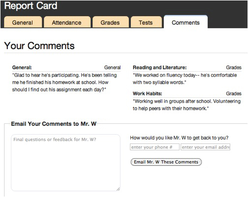
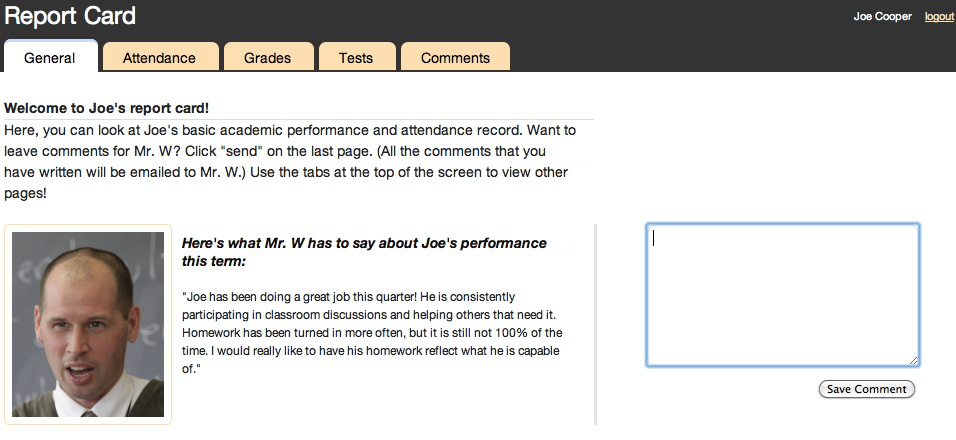
Our individual view (below) complements this with additional student data that was identified by parents, students, afterschool providers, and teachers as being especially relevant to their communications with each other. This view also gives parent and afterschool provider viewers the chance to comment on the data and send these comments to the teacher, sparking an exchange that can continue over email or in person. Here is the individual view’s final page, where viewers can review and submit their comments:
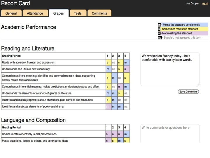
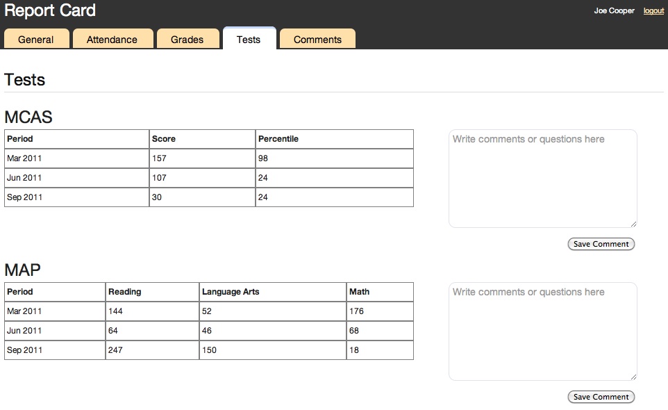
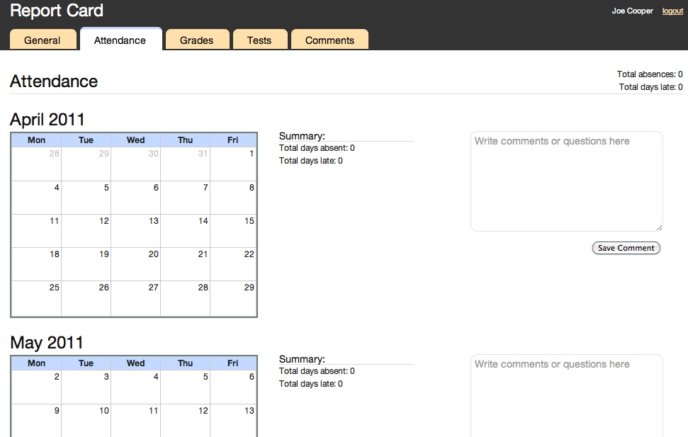
Note the tabs for viewing other pages at the top of the screenshot. The images below show the pages connected to each of these tabs, covering grades, test scores, attendance, and teacher summary comments.
In creating the individual view, we drew on a data display model from the New Visions schools in New York (http://www.hfrp.org/var/hfrp/storage/fckeditor/File/9thGradeTracker.pdf) combined it with Somerville’s locally designed K-6 report card, and worked with teacher Josh Wairi and his families (with advice from his students and afterschool providers) to integrate everyone’s insights into the testable product.
Our goal in fall 2011-12 has been to pilot and tweak these three tools with educators, administrators, families, students, and afterschool providers. We have wanted to explore the ways these tools can support teamwork among all these people – in meetings, one-to-one interactions, and email-based conversations about the data.
But here's the problem with designing and creating tools from scratch, on a budget: while our local technologist worked to produce tools to community specifications, he went slowly enough in responding to community feedback that when we wanted to start the pilot Sept 1, the views weren't ready.
So, our dashboards took a long time to design as we collected community input on design for months; local technologists, working for small amounts of money, created the tools but ran out of time and money to pilot them. We believe that the open source code will support next efforts at educational data display; we have added a tool to the “kit” by producing an open source dashboard and code next developers can modify. Still, the OneVille projects in which we used preexisting tools – Google sites or wikispaces for eportfolio software, and texting software like Google Voice – seeded the most longstanding local change.
Professionals able to produce tools quickly, or local technologists on larger budgets, might provide more ready open source infrastructure for schools and districts; for example, after the same local young technologist struggled to complete our Parent Connector Network hotline, the hotline was finally made by a new colleague at MIT who was inspired enough by the Parent Connector project that he did it for free.
Our work, and our ¡Ahas!
What was the basic groundwork needed to support the current work? How did the project change and grow over time? At this point, what are our main ¡Ahas! about improving communications in public education? What communication and implementation ¡Ahas! and turning points did we have over time?
Our main ¡Ahas! over time have been these:
¡Aha! A gap in student data equals a gap in service.
¡Aha! The families whose children most need assistance are often the hardest to reach with technology, but they are also the most in need of such rapid access to information.
¡Aha! One-Stop Shopping: It seems crucial to be able to see different kinds of student data at the same time, in a single display. Otherwise people waste time flipping between file folders, spreadsheets, or drawers.
¡Aha!Open source data tools could save schools across the country significant costs, IF design goes fast enough and IF tech support for open source tools remains available locally.
Communication and implementation ¡Ahas!, and turning points!
We had many ¡Aha! in sequence on this project over two years. To read the full story of the efforts that gave us these ¡Ahas!, click here!
In addition to our Main ¡Ahas! about data dashboards, we had other key discoveries along the way:
¡Aha! In addition to having the ability to quickly see and sort such basic data, diverse partners in young people’s lives need supports to communicate ABOUT basic data.
¡Aha! Many parents welcome an invitation into a conversation with their child’s teachers, and even if these parents are unfamiliar with technology, these parents often see technology as an opportunity for connection, rather than an obstacle.
Our products: Concrete communication improvements and next steps
We’ve gotten feedback from parents, teachers, and administrators about the dashboards’ potential value. In recent interviews, several immigrant parents emphasized the way the individual view dashboard could spark parent involvement: Smiling, one said, "Parents are not just left out of the school. With this, you are bringing them in, sucking them into the school curriculum!"
In a recent planning meeting with OneVille staff, Principal Vadhera described the value of the integrated dashboard tools, in contrast to the old system of requesting info from many different people: “Right now, in just five minutes, I have seen a complete picture of the kid. Without even checking in with folks [other staff]. Normally, I would have to wait for them to get back to me, and bring charts and graphs to meetings. What a great way to launch conversation.”
Purnima and Josh both suggested that the dashboards may enhance teamwork among educators at Healey: In staff team meetings, access to each view could allow teachers and administrators to collaboratively assess a student’s needs, design targeted interventions, and, if desired, record their plan by submitting it as subject-specific comments that get archived in the homeroom (lead) teacher’s email.
The families whose children most need assistance are often the hardest to reach with technology, but they are also the most in need of such rapid access to information. We’d need to continue this kind of outreach during a pilot phase, because we face the same challenges with the individual view as anyone working to enhance collaboration around students across barriers of income, racial/ethnic background, language difference and tech literacy. Not all parents have home access to computers and internet (though phones with internet access are increasingly popular), and some parents are not functionally literate in their home language.
The prototypes of the administrative and teacher views are complete, and the individual view is nearly complete. As described above, we planned to pilot our three “views” in fall 2011 and report out what we learned. However, the young local technologist who created these products to community specifications went so slowly on our limited budget that our grant dried up and we weren’t able to pilot them. One classroom’s teacher, families, students, and supporting teachers were ready to test the dashboard in fall 2011, as were their principal and local afterschool providers, but the developer’s slowness and ultimate tech support unreliability prompted a district administrator to pull the plug on the pilot – so the crack in the infrastructure remains.
The lesson here involves the timeline of software development, and the risks associated with community-based design research. The working relationship with the community partner (e.g., the school district) becomes asymmetrical when developing a software application from scratch - lots of work on the developer's end without immediate results for the community partner, potentially leaving them with “cold feet” by the time the product is ready unless major funding remains to tweak the product over time. We're optimistic that another community and next developer can pick up right where we left off, rather than starting from scratch like we did. The code for these dashboard products is now available online and free to the next developer (see below, Technological How-Tos).
While some at the Healey are disappointed not to try the dashboard, one piece of this project that has unflagging community support is our plan to work this year with the Healey PTA to create a model of basic computer and email training run by parents for other parents who need this support. Our goal was to link this training to the dashboard training for parents; instead our hook will be the school's newly schoolwide listserv. We’ve already established a computer in the PTA room, available for parent use at prescheduled times, and we’re reaching out to other computing facilities in the school and community organizations. We’ll be reaching out in particular to parents in Mr. Wairi’s new class about how to support them to access the Internet.
Questions to Ask Yourself if You’re Tackling Similar Things Where You Live
What big issues would we recommend others think about in their own attempts to improve communications in public schools? Contact us to talk more!
Here are some questions to ask yourself if you want to tackle similar things in your school:
- ➢Can everyone who needs to get and share important progress information, get and share it when they need to?
- ➢If not, what barriers are in the way and how can those be overcome?
- ➢To support young people, what “data” should show up on any data display, and why?
- ➢What data isn’t found in any “student information system” but should still be known?
- ➢What infrastructure would support actual conversations ABOUT "data," between the people who share young people? Which conversations should happen in person and which could be supported online? Could you do an experiment to test which works for what?
- ➢Is your district spending tons of money on data display tools to get basic data in front of people?
- ➢ If so, how could low cost tech development support such information-sharing?
- ➢ ***How can you ensure a small pot of resources for ongoing tech modifications and tech support after you have developed your tool?
Technological how-tos
Here's where we describe "how to" use every tool we used, so that others could do the same. We also describe "how to" make every tool we made!
Admin/Teacher View Source Code (written in the Django framework)
Individual View Source Code (written in the Ruby on Rails framework)
Click here for the Summary on this project; click here for the Expanded story on this project.
