Expanded story: Data dashboards
From Oneville Wiki
Written by Mica Pollock, Jedd Cohen, and Josh Wairi for the dashboard project, with dashboard development by local technologist Seth Woodworth.
Click here for the Summary on this project; click here for the Overview and key findings on this project.
The Details of the Work
The expanded story behind our efforts, our communication and implementation ¡Ahas!, and our turning points!
Click here for the Summary on this project; click here for the Overview and key findings on this project.
Starting off, and developing our goals:
As we began the OneVille Project back in summer 2009, we proposed to create a “dashboard” displaying basic data linking many youth- and child-related databases in the city. That was because many policymakers and researchers have a sense these days that the more data seen by more people, the better (see our Research Base page). But we quickly became unsure that “seeing everything” on young people was necessarily good – and especially, not clearly necessary at the level of the individual, family, teacher, and school administrator (does a teacher actually need to know a student’s police record in order to serve him better? Who exactly should see health data on children?). And anyway, the district was first interested in getting all of its own basic data viewable, quickly -- and that’s what we ended up working on in the end.
We also moved away from multi “sector”-database linking because SomerPromise, the Mayor's new site-based initiative to provide comprehensive youth services, was also interested in tackling the issue of linking databases across agencies, and we felt they were better positioned to pursue that goal even as we worked to lay groundwork for the effort by creating administrative and family-level views of school data alone. So, the goal became to create a simple data display that could help educators and families of youth in a single school see some basic data from district’s data warehousing software, Aspen X2, in a single view. This included creating a translated display easily understandable by an immigrant parent.
Throughout, we also became convinced that a dashboard shouldn’t just show data – it should help people communicate about it. Our rationale: Data displays in schools have traditionally been a) on paper and b) one-way. Think a report card or a quarterly report on one’s “scores”: schools or districts just “display” student scores to students and parents or show parents their child’s absences. Since OneVille’s goal is to support diverse partners in running communication about pursuing the success of young people, we wanted to make sure that parents could communicate back ABOUT data, to teachers -- and that tutors, teachers, and parents could over time communicate with one another.
¡Aha! In addition to having the ability to quickly see and sort such basic data, diverse partners in young people’s lives need supports to communicate ABOUT basic data.
In talking to families, teachers, and other service providers, we realized that just "getting data" on a student is never enough: people need to then converse (online, in person, or otherwise) about how the young person is doing and how they might be assisted. Just knowing how many days a child is absent is the first step, but then you need to have a conversation about why and what to do about it!
The community’s need for the work
Our work was shaped by a number of insights about necessary communications at the levels of student and family, teacher and classroom, school, and community.
¡Aha! One-Stop Shopping: It is crucial to be able to see different kinds of student data at the same time, in a single display.
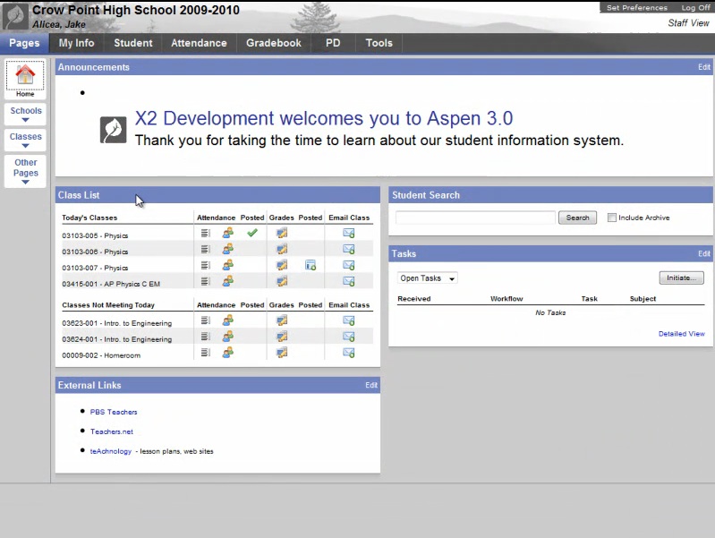
Our dashboard sits “above” X2, the district’s current database, and displays its data in a more easily readable format for more people.
Parents, teachers, and afterschool providers all had a range of concerns about the accessibility of the data as stored in the district’s current database, Aspen X2:
At the Healey School, older students and parents can log into X2, the student information system, to see updates on their grades, absences, etc. But many don't know that they do have passwords, and students told us they often forgot them. Any dashboard needs a password too, though, so it was really other issues that made a dashboard seem necessary: more importantly, once some of these users would get to X2, they found the format of the data there hard to understand. In particular, information isn't translated for non-English speakers.
When a teacher logged into X2, for another example, it was hard to see any student’s growth over time (i.e., test score growth) As Josh pointed out, test scores are kept in pure chronological order and since students take many tests, it was hard for anyone looking at X2 to see growth on a single test from year to year. Further, the “fields,” or “boxes,” keeping data in X2 didn’t have calculations like test score growth (they just showed one score, then the next). (Our technologist, Seth Woodworth, spent lots of time building “tubes” to make the dashboard automatically calculate this growth.) While the new report card importantly had sections for comments by teachers, those comments -- on particular skills listed on the report card -- only could be chosen from a drop-down list. Teachers could add longer summary comments on student progress only once per quarter, in the days when report cards “open” for updating and before they “close.” X2 also cuts off teacher comments at a certain length.
From an administrator’s perspective, different data sets were not automatically linked. For example, a request to the central office was required to link a table of attendance by student name with a table of MCAS score by student name. Principals also had to click through numerous choices within X2 before seeing any data at all. While queries to a busy central office could get a data report from staff, getting new data on demand -- during a staff meeting, for immediate discussion -- had not been feasible. 2010-11 principal Jason DeFalco explained that often, he was in meetings where people had to pull folders out to compare different spreadsheets on the same young people.
Finally, while some afterschool providers have direct access to X2, many don’t, meaning they had trouble knowing basic information like whether students who were coming to afterschool were going to school. For that reason, some important data fields were not kept in X2 at all yet, like the afterschool program in which children were enrolled or their attendance in that program. These providers typically kept their information in separate computer databases or even on paper. Again and again, people voiced the need to see all the data in one place.
And perhaps most interesting, the existing X2 system was set up only to house student data -- not to help people talk about it. In talking about our dashboard prototypes with parents, the major feature everyone emphasized was the ability to immediately comment ON data, rather than simply “look at it.”
Our dashboard conversations with DeFalco and Vadhera showed us that all our data did not come from the same place. Test score growth and years at Healey had to be calculated based on other data in X2, and crucial data fields were not kept in X2 at all, i.e., MEPA scores, ELL and IEP status, home language, and afterschool program. Because data in X2 was also not “linked,” or organized in the same way we wanted for our dashboard, our technologist, Seth Woodworth, spend lots of time building “tubes” from the different parts of the district’s X2 database to our dashboards. Incorporating this data into our dashboards impressed upon us how much work, by many different people at the school, was necessary to track comprehensive data on any student.
We ultimately had to leave out some data we considered using because it was not yet kept in X2 (e.g., afterschool attendance, and specific in-school tutoring services students received). X2 is itself modifiable, so Somerville X2 users have at times considered whether they want to enter these additional fields into X2.
Development Process
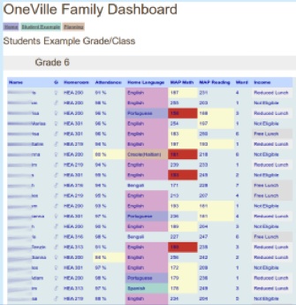
From the very beginning, in the 2009-2010 school year, we collaborated with a range of Healey community members to design the dashboard’s user interface. As it turned out, Greg Nadeau, Somerville resident and Healey dad, had already made a color-coded Excel spreadsheet for the Healey Principal the year before we began work on the dashboard. It was an early Excel version of what we came to call the Admin View. Here’s the earliest version of our Admin View:
Before we made the dashboard version of this view “live” by connecting it to X2, the school’s main need at the time was entering updated data into the Excel spreadsheet -- by hand. We knew that we would eventually develop a dashboard to automatically transfer data from X2, but the school needed to integrate the data sets immediately. So Susan Klimczak, from the South End Technology Center at Tent City, who would later become the lead organizer for the eportfolio project, did some valiant handiwork, assisted by colleague Al Willis. They cleaned up the current year’s spreadsheet and added new data typically not kept in X2 that the principal also wanted to see, like afterschool enrollment. We also had some regular meetings via phone conference with Greg and the principal to consider the patterns the principal wanted to see and the new "fields" for data that the principal felt needed to be created permanently in the district student information system (e.g., attendance in the afterschool programs. Afterschool programs weren't keeping this data in Somerville's core data system, X2, and still don’t.)
Turning point: The Teacher View
Josh Wairi, a 5th grade teacher at the Healey, got interested in the dashboard design when we stopped by his classroom one day after school in the winter of 2011. Looking together at his computer and printouts, we realized he was already creating spreadsheets of student data from X2 by hand. He was interested in quickly displaying and sorting basic data, to supplement his face-to-face and phone conversations with students and parents. His work showed us the need for what would become the “Teacher View,” a version of the Administrator View in which all the students come from the same homeroom.
Between this stage and the final version of the admin and teacher views (below), Mica, Seth, and Jedd met with Principal DeFalco several times during the 2010-2011 year and new Principal Vadhera beginning during the summer of 2011 to figure out the highest priority data fields for the admin view and to brainstorm potential uses. Based on DeFalco’s feedback, and with Seth’s programming skill, we developed a dashboard to automatically transfer data from X2 to a user-friendly view. Seeing Greg’s initial prototype, above, sparked DeFalco to suggest additional data fields: years at Healey, score growth on the MAP, ELL status, MEPA scores (English language learner assessments), IEP status, and afterschool program name (in the end, we did not add program name to the dashboard, because it was never made a real field in X2.) From this feedback, we developed the view below (names are fictional to ensure anonymity):
All data fields are visible on one screen – so there is no need to click through multiple windows to view the desired data. Viewers can sort up to three columns at a time simply by clicking at the top of each while holding down the shift key. With Vadhera, over the summer of 2011, we brainstormed additional uses for the admin staff, which are described below in the second-to-last ¡Ahas!, “Data really can launch a conversation.”
Turning Point: Making the report card online and interactive
Stories of parents and afterschool providers trying to communicate with teachers about students’ report cards prompted us to push forward on an “Individual View” that included the report card instead of just absences, grades, and test scores. Mica, Seth, Josh, and Jedd had many meetings in the spring of 2011 to brainstorm the design for this view, considering parent needs for accessibility and common communication challenges between teachers and parents. Josh was a critical resource on these issues.
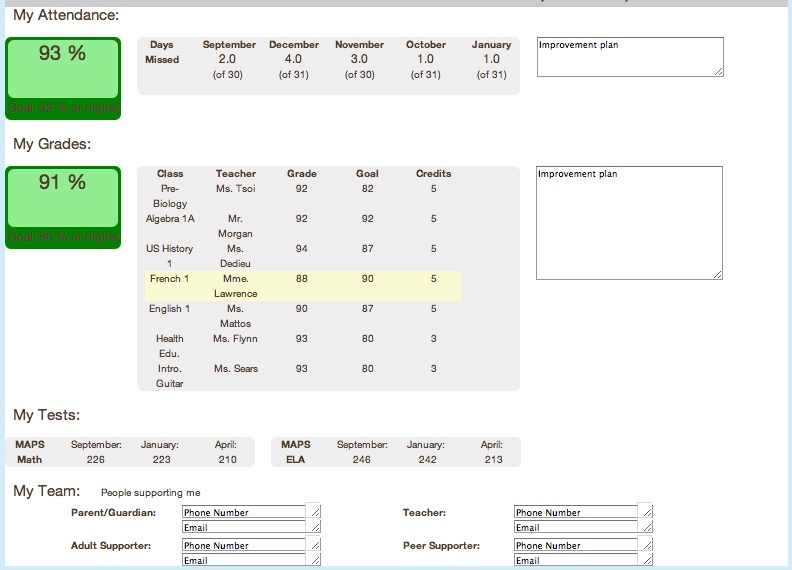
We had also been inspired by the New Visions for New Schools project, which has had success with a view that gives parents and students a quick understanding of student performance on quantifiable measures. (http://www.hfrp.org/var/hfrp/storage/fckeditor/File/9thGradeTracker.pdf) Compared with New Visions' view, we wanted to include the additional feature of allowing parents - and afterschool providers - to comment on any child's progress, send these comments to the teacher, and begin a conversation about how to support the student at home and in school. New Visions emphasizes a verbal agreement between family and teacher, called an “Improvement Plan,” so we created space on the dashboard page to write down this agreement. In our initial prototype, we did this by adding actual “Improvement Plan” text boxes in the right-hand side of the screen:
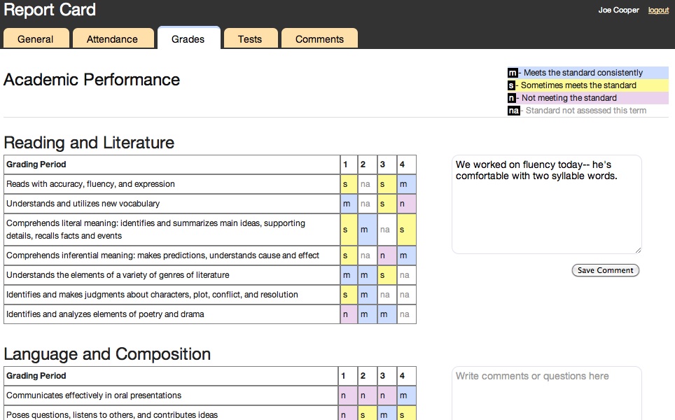
As we continued to develop the dashboard and add new types of basic data for viewing, we wanted to keep all the info on a single page for easy access, but new developments convinced us to spread the info out across several pages. At the time we were designing the “Individual View,” the District was ceasing to assign its elementary students numerical grades, or their equivalents on the typical A, B, C scale, and moving to a standards-based K-6 report card that asked teachers to grade students as proficient on a range of grade-level skills. So, we made Somerville's new K-6 report card (handed out on paper to families) online and color-coded. We also decided that we wanted the text boxes to prompt more of an ongoing conversation, rather than a formal quarterly agreement. So, we put these text boxes next to each chunk of data, with a prompt embedded in the “save comment” click button to encourage parents to write comments or questions. With the help of local technologist Evan Burchard, whom Seth recruited, we developed a revised version. The image below includes a sample tutor comment. That’s because in the months to come, we would realize that any approved viewer of the dashboard could comment:
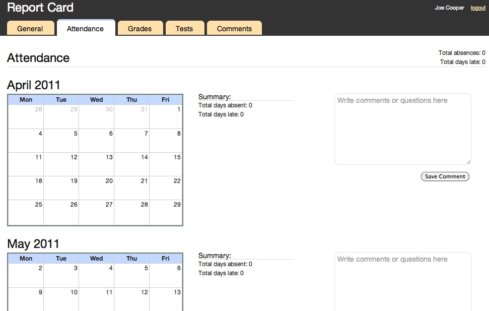
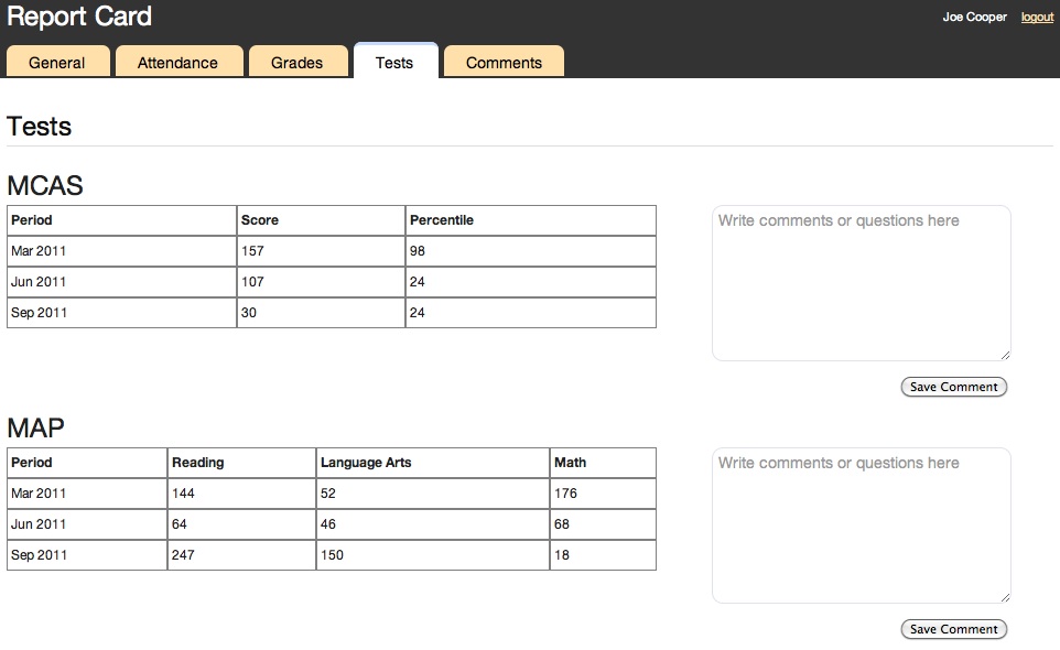
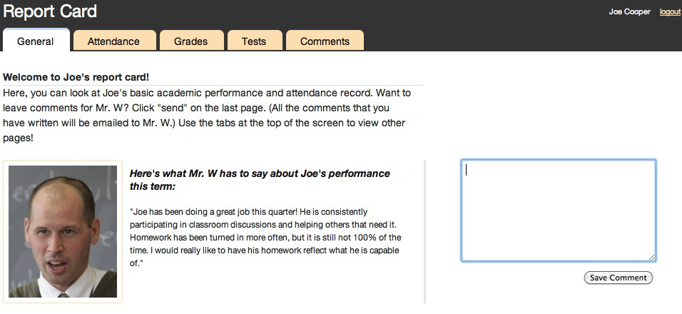
As we added the report card to the dashboard, we realized it was substantial enough that it needed its own page (above). In order to make the individual view as accessible as possible, even to families that are not used to looking at lots of quantitative data in one place, we spread the rest of the individual view’s information across several other pages, the names of which are visible as tabs at the top of each page. The individual view is now organized like a slideshow: Clicking on different tabs allows the viewer to see and comment on different parts of each student’s profile. We combined info about the student’s attendance and MCAS and MAP scores into the Individual View, which also includes the teacher’s quarterly summary comments from the report card:
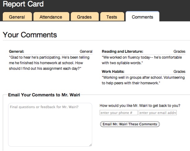
At this point, the Individual View offered many text box opportunities for parents and other service providers to enter comments. So, we created a “Comments” page, which captures all the comments entered for review before sending to the teacher. In thinking this through with Josh, we figured that the main (“homeroom”) teacher really had to be the “point person” for younger students in particular; so, all comments go to him/her as a starting point. On the dashboard’s final page, the parent or afterschool provider can also request that the teacher reply to their comments or make an appointment with them:
Parents or other service providers can specify any new contact info and convenient meeting times. After receiving these comments, the homeroom teacher can forward any relevant parts to the appropriate subject area teachers via email. (Rather than have parents automatically “reply to all” on comments perhaps best designed for the homeroom teacher, Josh felt that homeroom teachers would like to take the lead in responding to and informing other involved teachers or service providers about families’ comments. Testing how these conversational dynamics actually go was to be an important piece of the pilot.)
As we’ve worked to import the district’s translations of the basic report card rubrics, we’ve considered encouraging immigrant parents to use Google Translate as a first step to translate teachers’ own comments and to write back to teachers about their reactions. In the future, we’d like to offer a translated version of the basic individual view in Spanish, Portuguese, perhaps Haitian Creole, and other major languages at the Healey School.
Overall, knowing all the work that families and schools face on a daily basis, we’ve designed these tools to spark specific kinds of interaction around particular chunks of student data. How people use the tools will be up to them – but rather than have the tools just “display” data, we wanted the individual view, in particular, to also prompt and encourage communication about data.
Feedback
¡Aha! Many parents welcome an invitation into a conversation with their child’s teachers, and even if these parents are unfamiliar with technology, these parents often see technology as an opportunity for connection, rather than an obstacle.
We’ve asked for feedback repeatedly on the dashboard views, showing it to administrators, families, and afterschool providers, including doing focused interviews with parents and students from Josh’s own class (parents participating in the pilot this year will continue to be co-designers). In recent interviews, several immigrant parents emphasized the way the individual view dashboard could spark parent involvement: Smiling, one said, "Parents are not just left out of the school. With this, you are bringing them in, sucking them into the school curriculum!" When asked whether the dashboard might feel like extra work, another parent articulated his/her vision of parent involvement: “Not extra – you have children, you spend time to communicate. The more time you spend, the better students do.” One English-speaking parent with three children at the school explained that the dashboard’s comment and scheduling features solved a long-standing problem for her: After being a Healey parent for 11 years, she had only ever had time to meet with each of her children’s core academic teachers during PTA nights, but never the specialty teachers, e.g., music, art, support room teachers. Our dashboard could enable and encourage parents like her to submit their questions, requests for meetings, and updated contact info to the student’s homeroom teacher, who could forward it to the specials teachers. Another parent was especially enthusiastic about online access: “I do everything on the computer now.” And another immigrant parent said he does “everything” on his smart phone!
¡Aha! Data really can launch a conversation.
In a recent meeting with OneVille staff, Principal Vadhera described the potential value of the integrated dashboard tools, in contrast to the old system of requesting info from many different people: “Right now, in just five minutes, I have seen a complete picture of the kid. Without even checking in with folks [other staff]. Normally, I would have to wait for them to get back to me, and bring charts and graphs to meetings. What a great way to launch conversation.”
Online access to this data also could help close an even more basic communication gap, as Vadhera noted: “Even having this [individual view] up there [online] for parents to go back to,” could help when “the report card didn’t get in the backpack, or whatever.” She could see it being a powerful tool in conversations with parents who come in to see her, as there were often crossed wires about things as basic as students’ absences.
Purnima explained that on the admin view, she is interested in “anything that shows a gap.” Similarly, sorting attendance data by grade, for example, would save hours for staff who have typically printed the daily reports and then spent “a week” looking for patterns among the different pages.
In addition, she noted, students with IEPs and 504 plans sometimes need accommodations on the MCAS, and Purnima often spends “hours” going over the paper lists and checking with the teachers to ensure that everyone’s accommodation needs have been met. Our tool will allow her to sort by IEP and 504 status, so that all these students appear together, and, as she said, “so we don’t have moments when things fall through the cracks.”
Purnima and Josh both suggested that the dashboards could enhance teamwork among educators at Healey: In staff team meetings, access to each view could allow teachers and administrators to collaboratively assess a student’s needs, discuss and design targeted interventions, and, if desired, record their plan by submitting it as subject-specific comments that get archived in the homeroom (lead) teacher’s email. Such team conversations could involve the school’s “student support team,” a standing group of educators that Purnima described as “the central nervous system of the building,” including Purnima, the Vice Principal, Nurse, and Adjustment/Redirect Counselor. Josh explained that another advantage to the individual view is that in contrast to his whole-class spreadsheets, it could allow him to present a single student’s data in one of these team meetings without revealing all the other students’ grades unnecessarily (a breach of confidentiality). Finally, another relevant team that could use the dashboard to look at data together (even remotely) is made up of each student’s individualized group of supporters, e.g. their homeroom teacher, Special Ed or ELL specialists, and reading/math resource room staff. Josh expressed interest in piloting the dashboard this way.
¡Aha! The families whose children most need assistance are often the hardest to reach with technology, but they are also the most in need of such rapid access to information.
We planned to continue substantial parent outreach during the pilot phase to show parents how to use the dashboard. We would face the same challenges with the individual view as anyone working to enhance collaboration around students across barriers of income, racial/ethnic background, language difference and tech literacy. Not all parents have home access to computers and internet (though phones with internet access are increasingly popular – and our dashboard can be accessed through a smartphone), and some parents are not functionally literate in their home language. The same work schedules that make parent-teacher meetings hard also make it hard for some parents to coordinate their schedules with the computer labs at local libraries or in the housing projects where some families live. (Also, to look at an online data display together, educators too need internet access -- not always easy if people meet in a room without a computer, wireless, or a laptop to plug into an ethernet cable.)
Several years from now, the proliferation of smartphones and iphones will likely shrink this challenge dramatically, making it easier than ever for partners to join the conversation about student data.
As of mid-October, 2011, the prototypes of the administrative and teacher views were complete pending new data from the District (which required building final "tubes" to the district's student information system), and the individual view was nearly complete. We hope that these dashboards will be useful enough, wherever they’re implemented, to help supporters ensure that students’ needs are met, spark collaboration among educators and families, and if useful, catch on. As Principal Vadhera explained about our planned incremental approach to implementation at the Healey School, “A lot of ideas start like THIS (gestures big with hands). And then they fail. This is a guinea pig, Josh could always share back, move forward in small increments. Teachers might just want to get on board with this!”
We planned to pilot our three “views” at the Healey in fall, 2011 and report out what we learned. However, the young local technologist who created these great products to community specifications went so slowly on our limited budget that our grant dried up and we weren’t able to pilot them. One classroom’s teacher, families, students, and supporting teachers were ready to test the dashboard in fall 2011, as were their principal and local afterschool providers, but the developer’s slowness and unreliability prompted a district administrator to pull the plug on the pilot – so the crack in the infrastructure remains.
The lesson here involves the timeline of software development, and the risks associated with community-based design research: The working relationship with the community partner (e.g., the school district) becomes asymmetrical when developing a software application from scratch - lots of work on the developer's end without immediate results for the community partner, leaving them with “cold feet” by the time the product is ready. We're optimistic that another community can pick up right where we left off, rather than starting from scratch like we did. The code for these dashboard products is now available online and free to the next developer. Our goal has always been to launch an open source dashboard design that could contribute not only in Somerville if it proved useful, but elsewhere through iterative development.
One piece of this project that has unflagging community support is our plan to work this year with the Healey PTA to create a model of basic computer and email training run by parents for other parents who need this support. We’ve already established a computer in the PTA room, available for parent use at prescheduled times, and we’re reaching out to other computing facilities in the school and community organizations. We’ll be reaching out in particular to parents in Mr. Wairi’s new class about how to support them to access the Internet.
